Ready to transform your editorial design? I am proficient with the Adobe Suite and passionate about bringing type to life! From fascinating, creative designs to more sophisticated layouts, let’s discover something that suits your brand.
giddy, what’s up? Magazine, Editorial Design
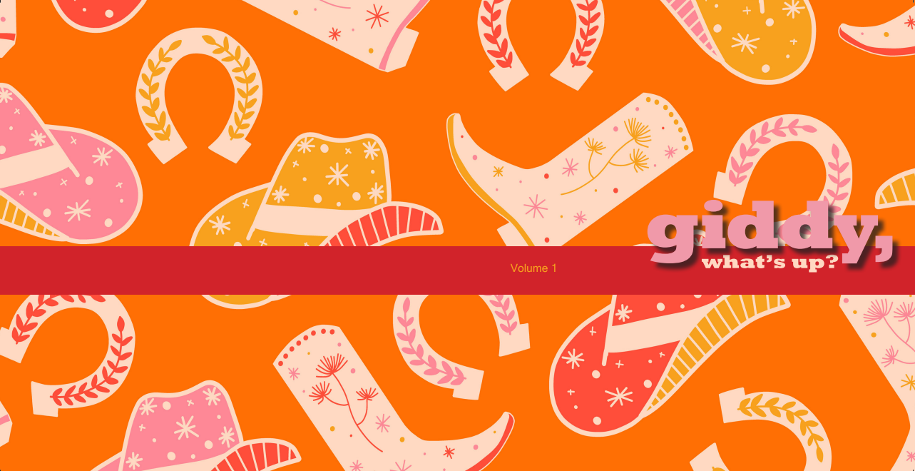
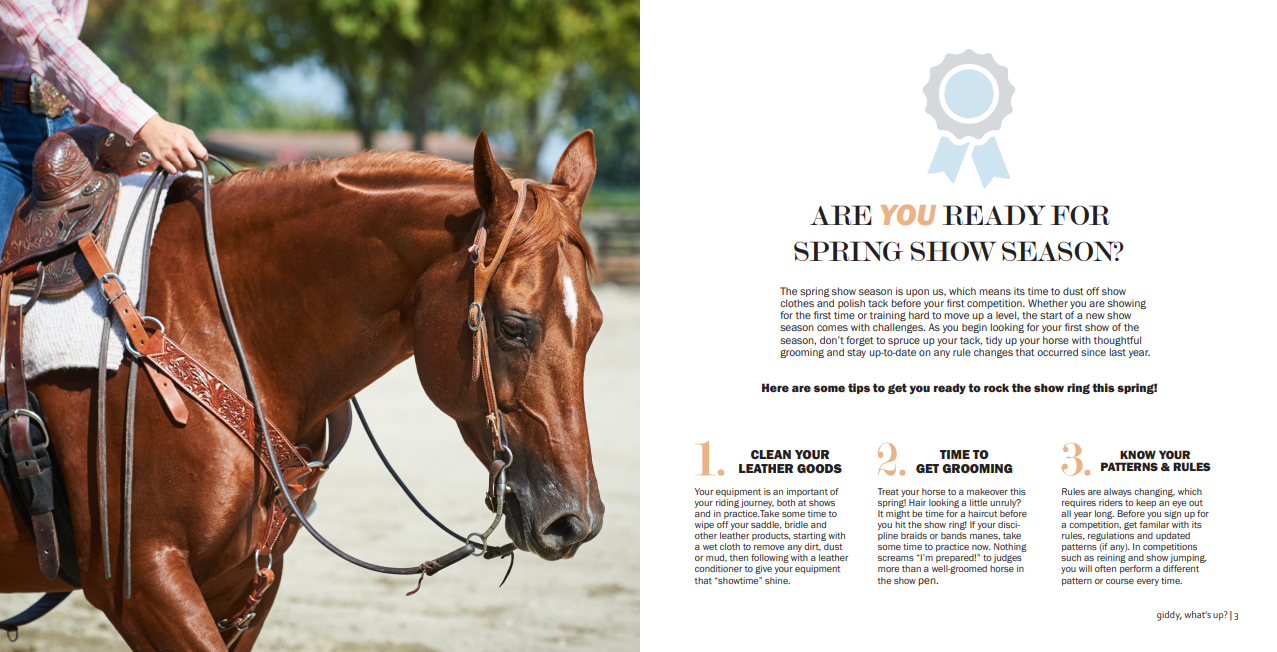
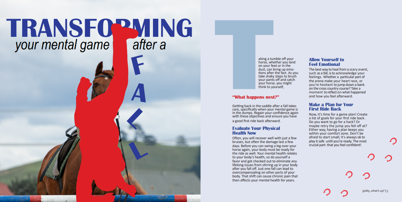
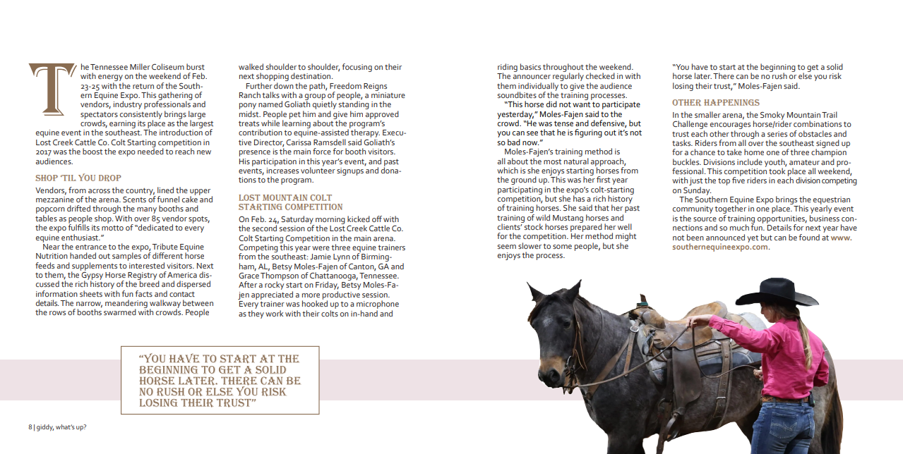
As an avid equestrian myself, I was so excited to create a mini magazine focused on equestrian lifestyle. giddy, what’s up? is 8X8 inches with 12 pages. In addition to designing the spreads, I also wrote every article myself. I covered a range of topics, including mental health, events and a discipline feature.
Software Used:
- InDesign
- Photoshop
Muscle Girl Apparel,
Logo Process Book
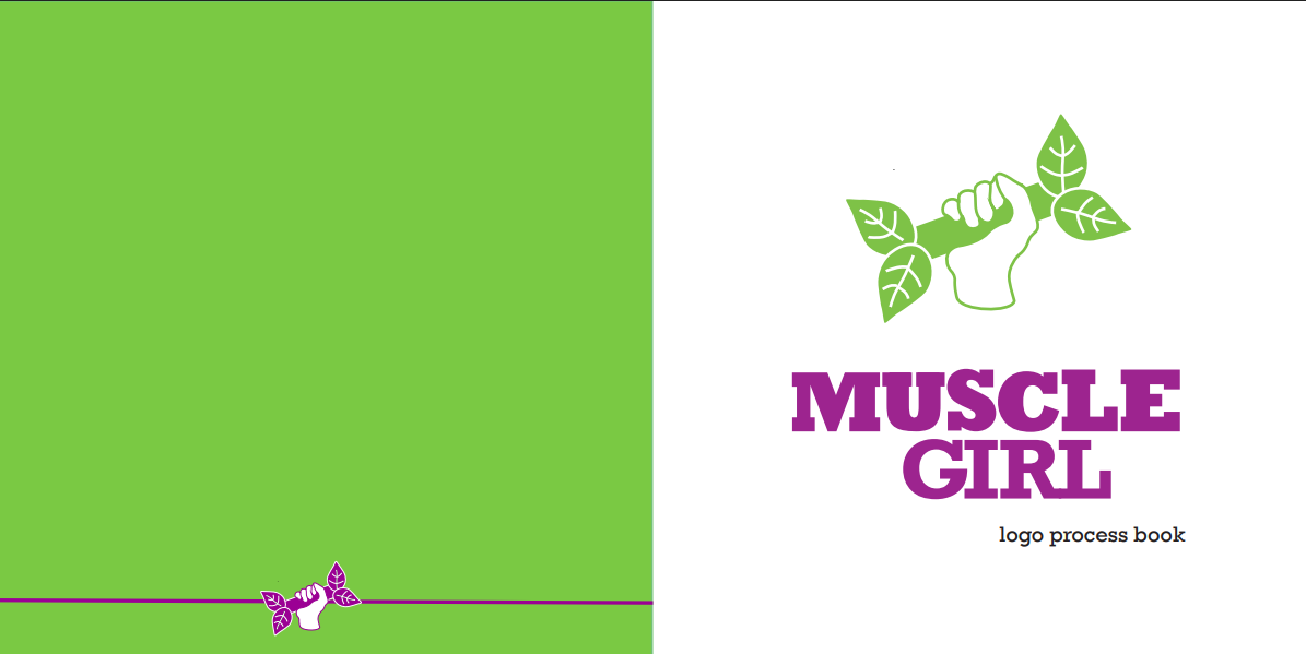

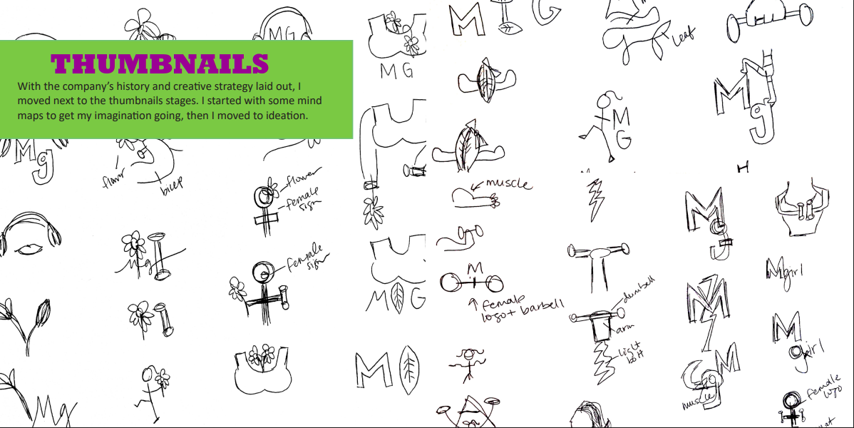
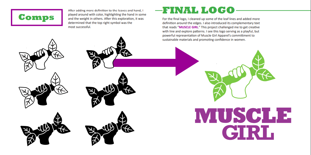
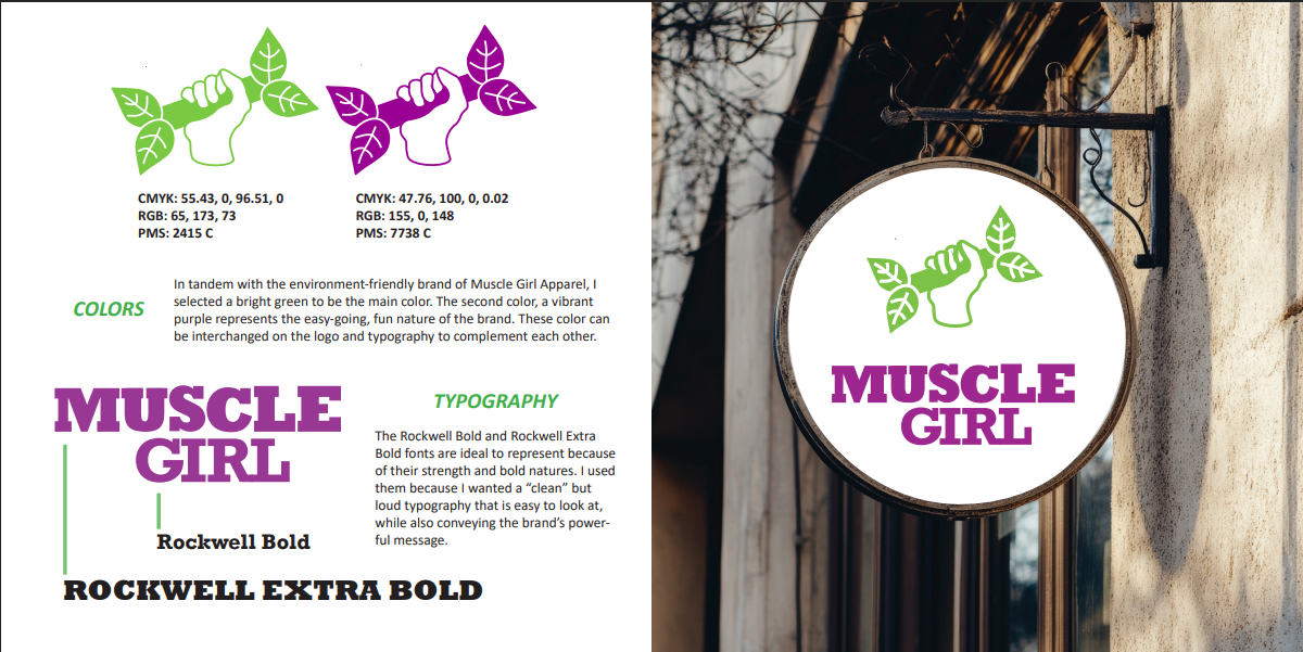
Take a peek at the steps I took when creating a logo for the fictional Muscle Girl Apparel brand. From thumbnails to a finished logo ready for branding materials, I cover the full process in this booklet. I built on themes of strength and sustainability to create the Muscle Girl logo seen above.
Software Utilized:
- InDesign
- Illustrator
- Photoshop
Noah Kahan Shirt Mockups, Apparel Design
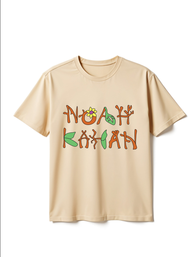
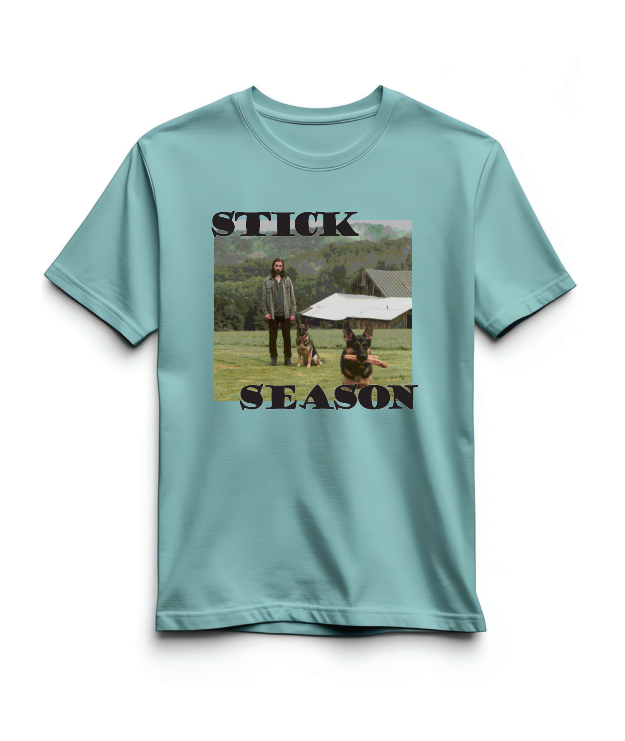
These T-shirt designs are inspired by Noah Kahan’s latest album, Stick Season. I brainstormed designs based off various songs, including “Stick Season,” “Everywhere, Everything” and “She Calls Me Back.” I landed on a design that reflects Kahan’s strong emphasis on nature and themes of growth and reflection.
Software Utilized:
- InDesign
- Illustrator
- Photoshop
Chat Magazine Project, Editorial Design
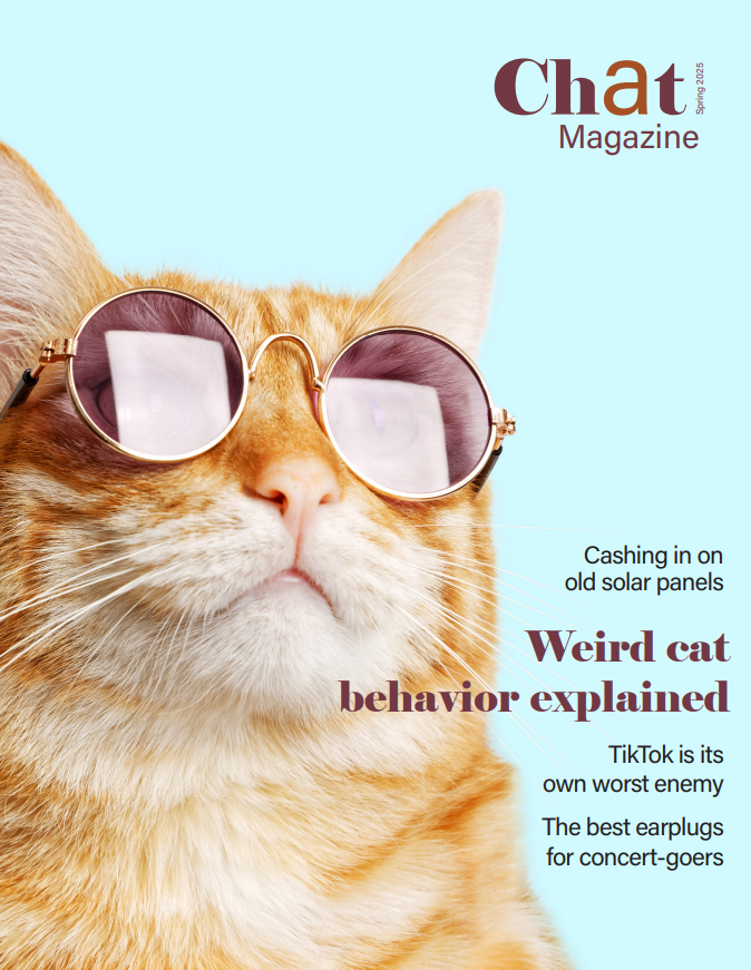
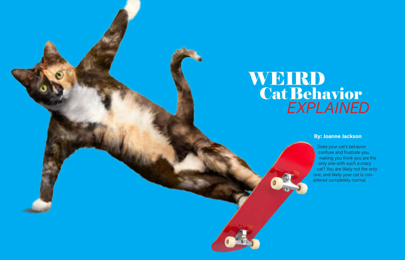
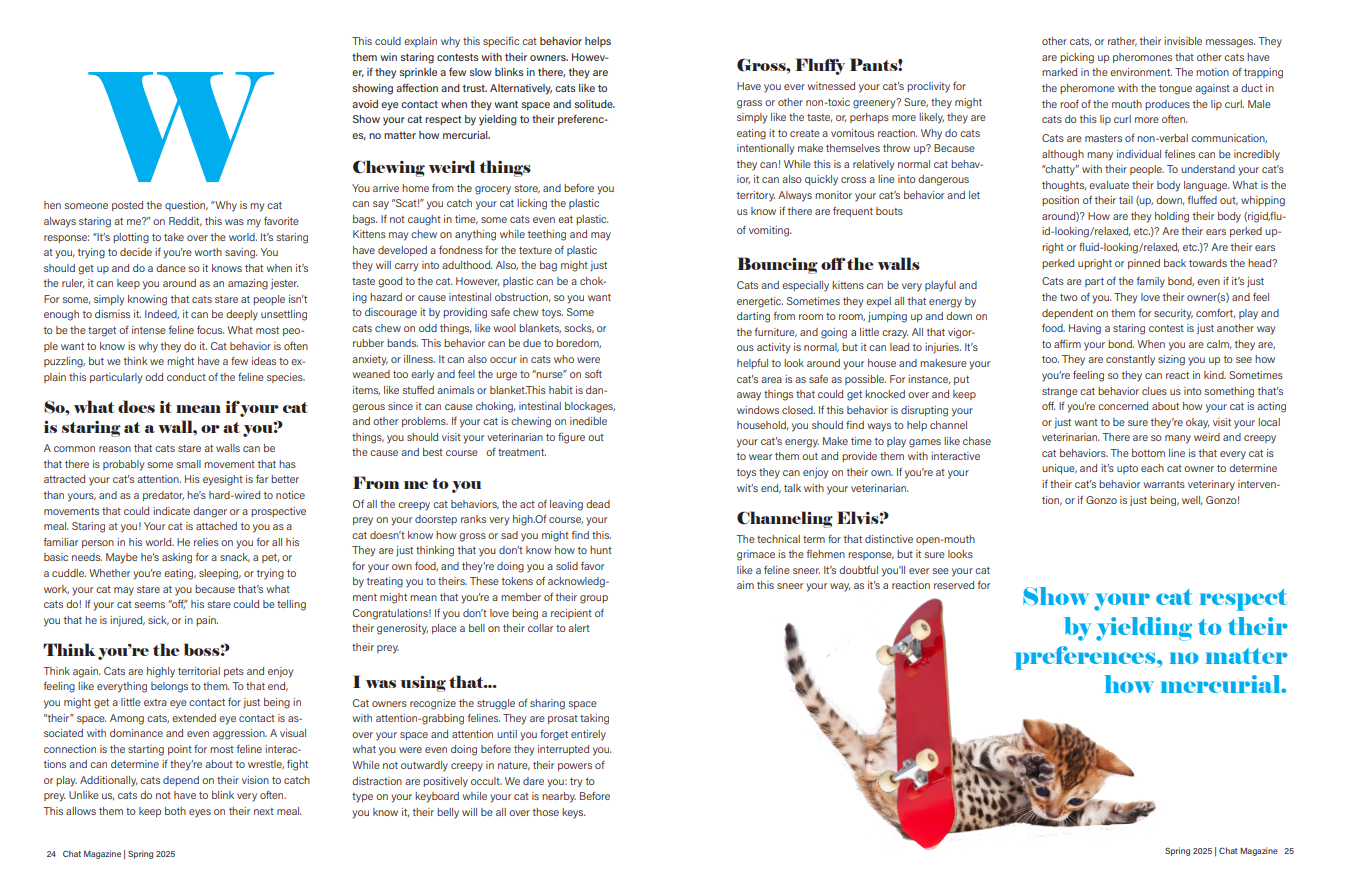
For this project, I was tasked with creating a magazine cover that represented the fictional Chat Magazine’s main story “Weird cat behavior explained,” along with its two other article titles. The second part of the project was to format the main story and create graphics that engaged readers with the content.
Software Utilized:
- InDesign
- Illustrator
- Photoshop
I really enjoyed creating this cover because it allowed me to get creative and colorful! I first designed the Chat Magazine logo in Illustrator, a complementary combination of bold and regular sans serif fonts. Lastly, I played around with cover art. Next, I formatted the article headlines on the cover. I had them on the left initially but switched to the right. With the text stretching toward the left and the image toward the right, it creates a sense of balance.
